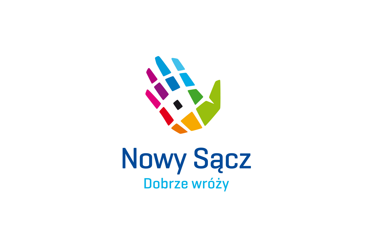
The city of Nowy Sącz with its nearly 720 years of tradition needed an image that would reflect its multidimensionality, modernity, entrepreneurship, openness and history.

Analyzing the strategic documents of the town we noticed that the plan of the town resembles a human hand and this symbol was used in the project of the Nowy Sącz logo.

The work on the visual identification of Nowy Sącz included:

  • analytical phase,
  • social consultations,
  • logo project,
  • development of the claim,
  • jobbing print design,
  • design of sample promotional materials,
  • developing a brand book,
  • development of visual identity template,
  • author’s supervision over implementation.

New bold image of the city enriched with our claim, aroused controversy in the media, being finally awarded and appreciated in many prestigious contests.

See similar projects

Rebranding

Promedica24

Branding

Tramwaje Warszawskie

Visual information system

AED